NORDIC BLOOM
Premium Finnish Tea and Biscuit Gift Set
Contracted Project | 8 Weeks
My role: Structural Packaging Designer and Concept Developer


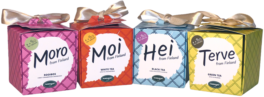
Despite being Finland’s oldest tea house, Nordqvist lacked a cohesive identity
and strong appeal within the domestic and international tourist market.
Our challenge was to fix this...
What is Nordic Bloom?
NORDIC BLOOM is a petal-opening gift package that transforms a compact folding carton into an expressive unboxing experience. Developed for Nordqvist, the collection pairs Finnish-inspired tea and biscuits with seasonal colours, regional greetings and illustrated patterns, creating a distinctive souvenir for domestic and international tourists.
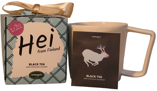
Unboxing Experience
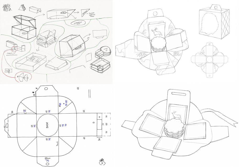
The packaging is a petal-opening folding carton made from a single sheet of card. A ribbon gives it the appearance of a conventional gift, while also forming a small carrying handle. When opened, the carton unfolds like a flower to reveal the products inside, forming a place mat, making the unboxing experience part of the gift.
Visual Packaging Concept
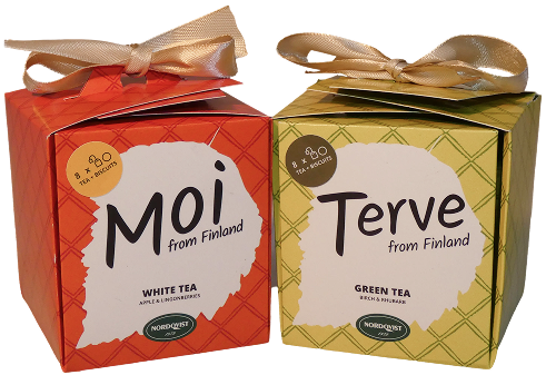
The collection was developed as four regional variations, each pairing a Finnish season and location with a distinctive flavour profile, colour palette and Finnish greeting.
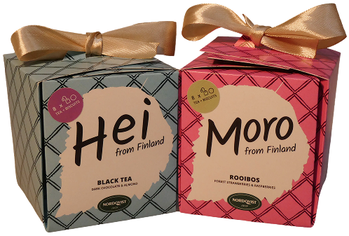
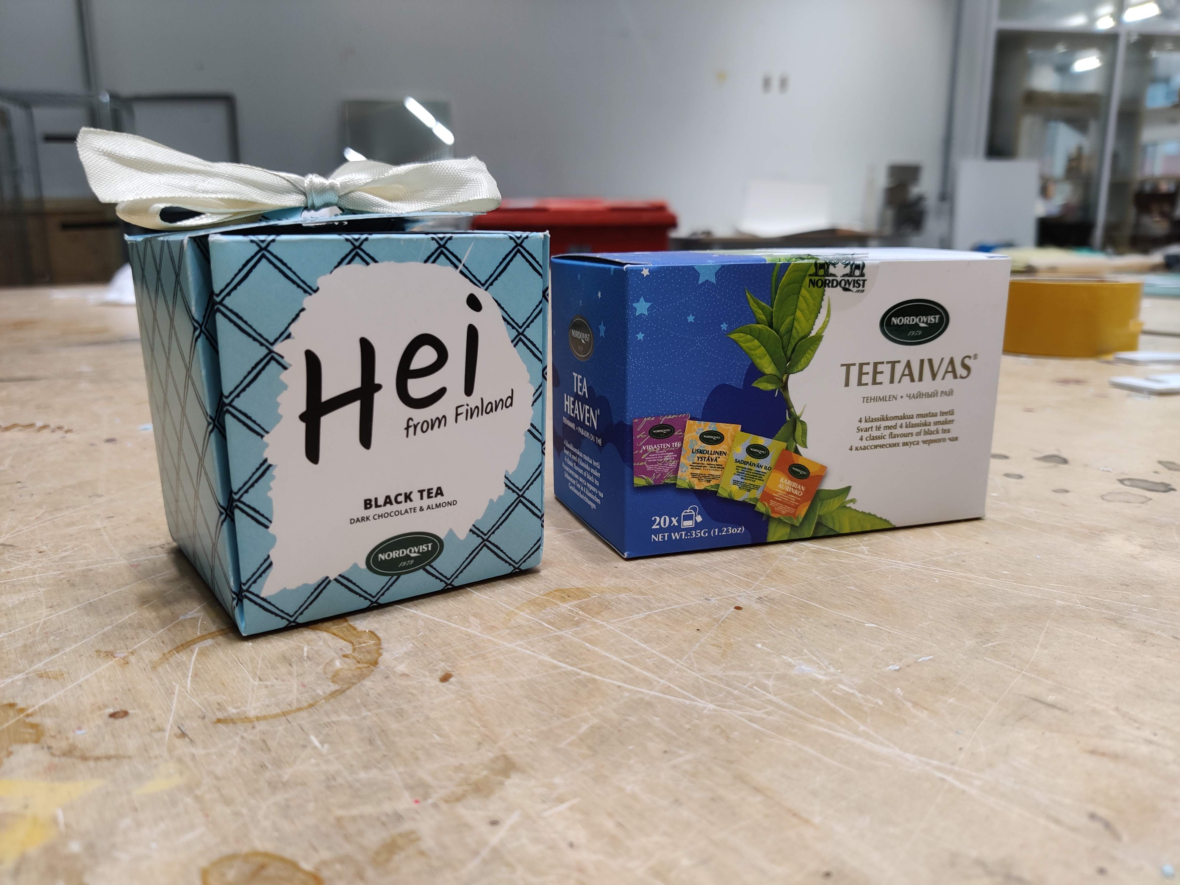
Hei from Finland, Winter, Northern Finland
Black tea with dark chocolate and almond
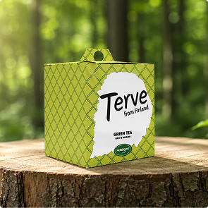
Terve from Finland, Spring, Western Finland
Green tea with birch and rhubarb
Moro from Finland, Summer, Southern Finland
Rooibos with forest strawberries and raspberries
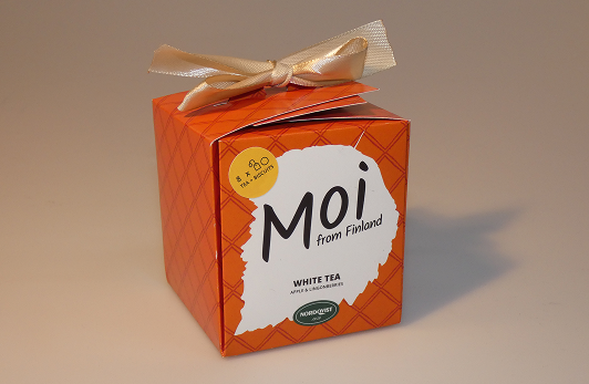
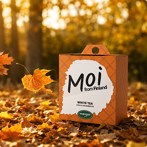
Moi from Finland, Autumn, Eastern Finland
White tea with apple and lingonberries
How might we create a distinctive premium tea gift set that captures Finland’s identity, appeals to domestic and international tourists which stands out in competitive retail environments?
Inspiration & Development
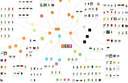
To begin, I analysed Nordqvist’s existing product range, business objectives and current developments. Surveys were conducted in public to understand user taste profiles and desired packaging attributes.
Furthermore, interviews with tourism market advisers provided valuable insight into how the packaging should be positioned for domestic and international visitors.
Development Criteria
- Create a premium and memorable unboxing experience
- Communicate a clear Finnish identity
- Stand out in competitive retail environments and appeal to domestic and international tourists
- Remain compact and travel friendly
- Simple and mass producible structure
- Protect the contents
Sketches
Prototyping
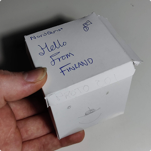
V1
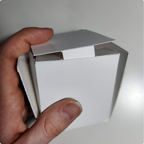
V2 with locking lip
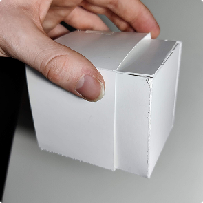
V3 with Premium card sleeve
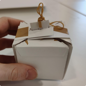
V4
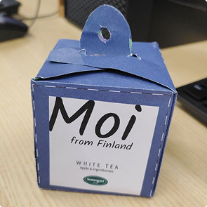
V5 beginning the final variations. Testing with contents e.g. biscuit types.
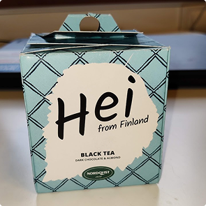
V6 Final prototype, adjusting the printing, colour grading and ribbon hole strengthening.
Design File
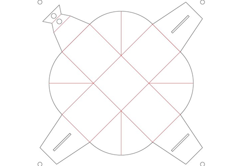
Adobe Illustrator was used to produce the nets for the packaging and overlaying the graphics produced by the graphics and textures team Natasa Hodosi, Wen Ouyang and Johanna Masalin.
Manufacturing Details
For the packaging I decided to use: 350 gsm gloss coated card, GC1, was used as this is a card used in premium packaging.
The printing method used was CMYK sheet fed offset lithography with Livia Solvin.
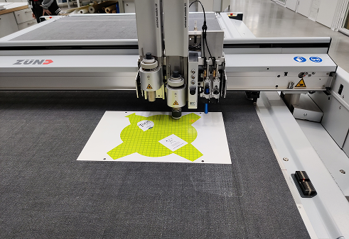
The packaging was then cut out using a Zünd G3 table cutter.
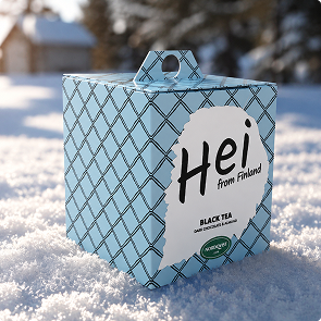
Renders (Keyshot)
Final Packaging Photographs
Tee hetkestä elämys.
Make the moment an experience.